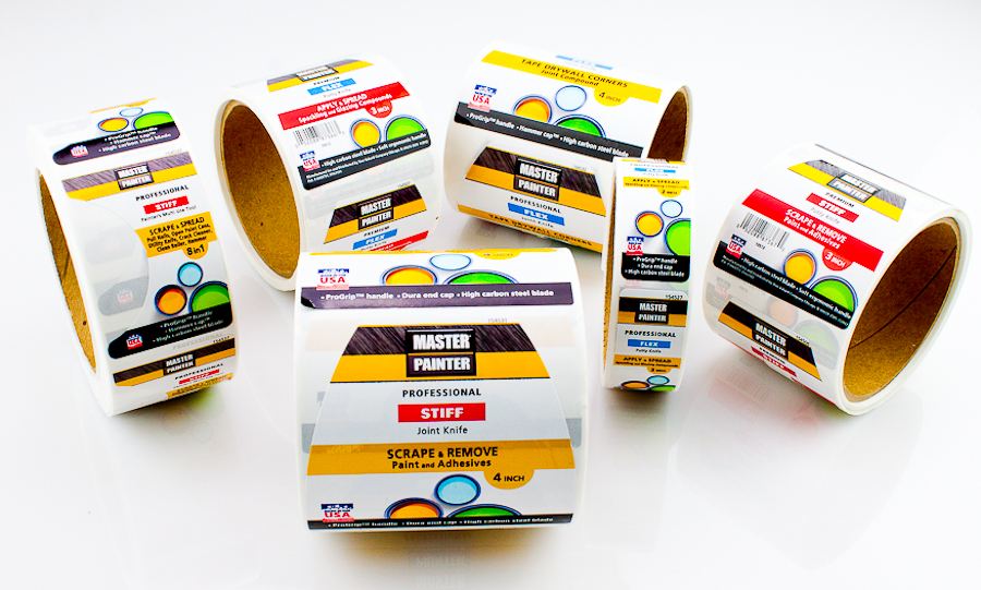
It’s a pretty simple concept to grasp – unless you plan on letting folk take a big bite of whatever it is you’re selling prior to buying it, it’s the label on the packaging that sells your food products. In an ideal world you’d be able to hand out a free sample to every last punter in the supermarket in full confidence that they’d then buy your little package of wonder. Sadly though this isn’t an ideal world in any way, which in turn means that no matter how wonderful the product beneath the packaging is, its fate will be determined by the label thereon.
No pressure there.
Once this has been acknowledged you’re half way home, but at the same time it’s important to realise just which elements of the label itself play the most crucial roles. Yes, the images are important and of course you need to pick appropriate colours, but at the same time you really won’t get anywhere with the wrong choice of fonts.
Is there such a thing as a ‘right’ or ‘wrong’ font in a general sense? Well, it all depends on what it is you’re selling, but regardless of what it is, how great it is and how much you want to stand out, there are certain rookie errors that could hamper your efforts in a big way.
Here’s a list of a few key examples as noted by Days Labels:
1 – Too Many Variations
Right off the bat, just because there are thousands of pretty fonts to play with doesn’t mean you should be using every last one of them on your labels. Yes, they’re attractive and delightfully creative, but the more fonts you put together in the same place, the messier the final label looks.
As a rule of thumb, simplicity is always the best way to go. Your label is there to communicate important information and to look attractive – not to be a contender for next year’s Turner Prize. Feel free to go as wild as you want with your brand’s logo and that kind of thing, but when it comes to information presented by your label, keep it simple and limit variations.
2 – Ignoring Hierarchy
Whether they realise it or not, every consumer in every shop the world over responds to different sizes of lettering in a different way. In terms of packaging for example, the information printed in the largest font is interpreted as most important, medium-sized for still-important product details and smaller fonts for the superfluous stuff. This is precisely why ‘Fat Free’ written in a massive font tend to get its point across much clearer than when written in 6pt somewhere on the back.
This matters in a big way because it gives those trying to market a product the ideal opportunity to shout out the most important information and whisper anything of lesser importance. Generally speaking this means the name of the product in the largest font, the brand’s name or logo secondary in size and then finally the rest of the spiel.
3 – Overly Small Fonts
Even if you happen to be selling a product that necessitates a label no bigger than a postage stamp, you still need to be wary of using fonts that are too small. This also applies to the use of complex and overly fancy fonts – always a bad idea when space is limited. Not only are small or complex fonts often unreadable to anyone without perfect vision, but they also give the impression of their being way too much information that most buyers won’t bother taking the time to read.
4 – Overdoing the Info
And just to finish on that exact point, there’s a time and a place to tell the prospective buyer the whole history of the company and everything there is to know about you and what you do – the back of the label isn’t always it. Where space is at a premium, the key lies in communicating what’s important to sell the product in the first place, while at the same time showing them the way for if they want to find out more.
It can be as easy as adding your firm’s website address, telephone number or something like a QR code to send them in your general direction should they so wish. The idea is that once you’ve tempted them to try the product itself with your frankly awesome label, they’ll be interested in finding out more about you at a later stage and will hopefully become putty in your hands…proverbially speaking, of course.


Recent Comments