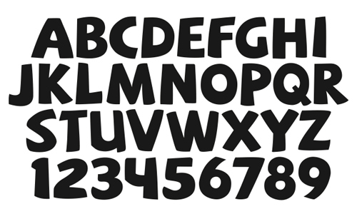
You may not realize it, but the fonts you use actually speak volumes about you. This is the reason why some businesses use particular fonts. Some fonts are just more professional than others.
Some fonts are also easier to read than others, as anyone that spends a lot of time online can attest too. There are certain fonts writers are recommended to use, even in print books. You don’t want to give your readers a migraine while they’re trying to read what you have to say, do you?
Certain font colors can also be better than others. On a white background you’re pretty safe staying with black, or maybe even a blue. Don’t use bright colors like yellow online that can hurt people’s eyes though.
The Font You Use
The font you use says a lot about you, according to research done by Wichita State University. They found that fonts to reflect personality types in people, as well as their attitude and mood.
Times New Roman is a default font for Word, and if you are one of the people that stick with this particular font you are a polite person, you are stable, and practical. This font is recommended for businesses of all types.
Comic Sans has a bad rap. It’s disliked by many people that work with words on the web. If it happens to be your font of choice this could mean that you are youthful and wacky. While you like a fun font, remember you are probably annoying your readers.
Many online writers tend to use a font like Arial. If you prefer this one may be considered to have no imagination, but at least you choose to use a font people can easily read!
Why Does It Really Matter?
Again, some fonts are just harder to read, and some don’t cross over well from one platform to another. You also need to pay attention to the color of your font in conjunction with the color of your background. This is another place you’ll cause headaches for your readers!
If you’re using a font you aren’t sure about, ask a few people to check it out. You’re sure to get comments on whether it has good readability or not.
So, if you were a font what font would you be? Something fancy and curly that’s too hard to read unless it’s at like 50? Or would you be the quirky yet hated Comic Sans that many people just wish didn’t exist.
If you want easy to read but don’t like Times New Roman, try something simple like Garamond, Cambria or Calibri. All of them are nice and simple, yet easy to read and pleasing to the eye. Don’t make your readers strain or they may stop reading!


Recent Comments